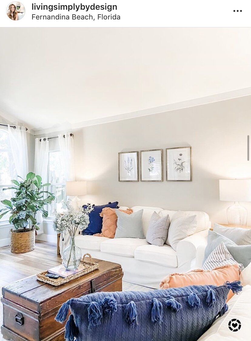
Agreeable Gray- The Splendid Neutral!
Picking out paint colors might be on my top 5 list of the most stressful things. Thankfully we have Pinterest, Instagram (https://www.instagram.com/livingsimplybydesign/) and other resources to help us in the decision process, but it can still be a stressful. Today I wanted to take some time to talk about Sherwin Williams Agreeable Gray and show you some homes with different lighting and decor styles so you can get an idea of what the color looks like in a few different homes.
First, let’s talk about the color itself and my opinion on it. The majority of our home is painted with Agreeable Gray. It is a beautiful soft gray that gives a space a very warm and inviting feel. I prefer it in rooms with a lot of natural light and neutral decor- whites, grays, blues. In full transparency, we had our master bedroom painted Agreeable Gray initially, and it ended up being too dark. There is only one full window in there and then we have patio doors (they don’t bring in much light), and it was very dark. We opted for a lighter shade in there (Cloudy Gray by Magnolia Home). In my main living spaces, I absolutely love Agreeable Gray and I am so happy with my decision.
I thought it would be helpful to show you the color not only in our home, but a few other homes that I love as well. So here’s some photos of different spaces- all painted with Agreeable Gray.
Photo Credit: https://www.instagram.com/angela.hodges_abode/
Photo Credit: https://www.instagram.com/bear_creek_farmhouse/
Photo Credit: https://www.instagram.com/mysoutherncharmer/


